MATH 1040 - Introduction to Statistics
Lesson 4.6 Bargraphs
Reading
Reading sections are from the Introductory Statistics Textbook
- 2.3.1 Contingency tables and bar plots (pages 70-71)
- 2.3.3 Segmented bar plots (pages 73-74)
Lesson
A bar graph is simply a display of the count or frequency of different categories. For example, if we are talking about the number of medals one in the 2024 Olympics, We can use a bar graph to show the distribution of gold, silver, and bronze medals. Here is the data from the 2024 Olympics showing the number of medals won by the host country, France:
| Medal Type | Count |
|---|---|
| Gold | 16 |
| Silver | 26 |
| Bronze | 22 |
To create a bar graph, we need to start with a scale. But what do you do for a scale with categorical variables? For a bargraph, create an x-axis and a y-axis. List the Categories along the x-axis and set the scale of the y-axis such that it is more than any single category. Once that is done and labels are attached to each axis, we just draw a bar extending from the x-axis up to the count for that category. Below is the graph of the data in the table above.
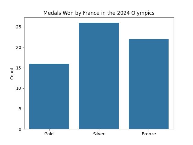
The height of the bar is determined by the number for each category. An alternative to the count would be the frequency, or the percentage of data in that category. In this example, we take the total number of metals one, which would be 16 + 22 + 29 = 64, and divide each count by that total to get the percentage, or frequency, of each category.
| Medal Type | Count | Frequency |
|---|---|---|
| Gold | 16 | 16 / 64 = 0.250 = 25.0% |
| Silver | 26 | 26 / 64 = 0.406 = 40.6% |
| Bronze | 22 | 22 / 64 = 0.344 = 34.4% |

For this class, this is all you will need to know for bargraphs. However, know that bar graphs can be more complicated. For example, here is a bargraph that shows all the metals one by the 9 countries that won the most medals. The bars are colored differently based on the number of metals they got in each category.
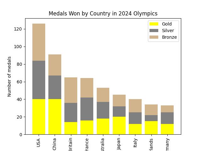
One final note. Notice how in this last graph, the bars are arranged in descending order. Such a graph is known as a Pareto chart. To make a pareto chart, just rearrange the categories so the largest category is on the left and the smallest is on the right.